The glossy one
Crisp, punchy, high-saturation. Closer to polished commercial stock than Grok’s grit or Nano’s haze — clean and vivid, occasionally a touch over-produced.
ByteDance
Sharp, saturated, stock-photo slick — and the most literal on the products.
ByteDance / 2K / 1:1 / bytedance-seed/seedream-4.5
The images
Same standard set, same framing, same model comparison surface.
I · Through the ages
Same eleven eras, two life stages, side by side: a group of fresh-faced nineteen-year-olds doing what the young did — hunts, dances, mosh pits, raves — next to middle-aged forty-year-olds doing what the settled did — harvests, workshops, offices, backyard parties. Different people, different lives, one timeline. Watch how each model handles youth vs. age across history.
II · Fashion & portrait
Editorial polish, neon glamour, old-Hollywood and couture, and a 1950s centerfold — faces, skin, fabric, and styling.
III · Product
Reflections, materials, and one duck modeling everything — the commercial-shot test, with a surreal closer.
IV · Pets
Small animals, soft light — the “make-it-adorable” test.
V · Food
A six-patty monster, two models eating it, and a humble popsicle dressed up like luxury perfume.
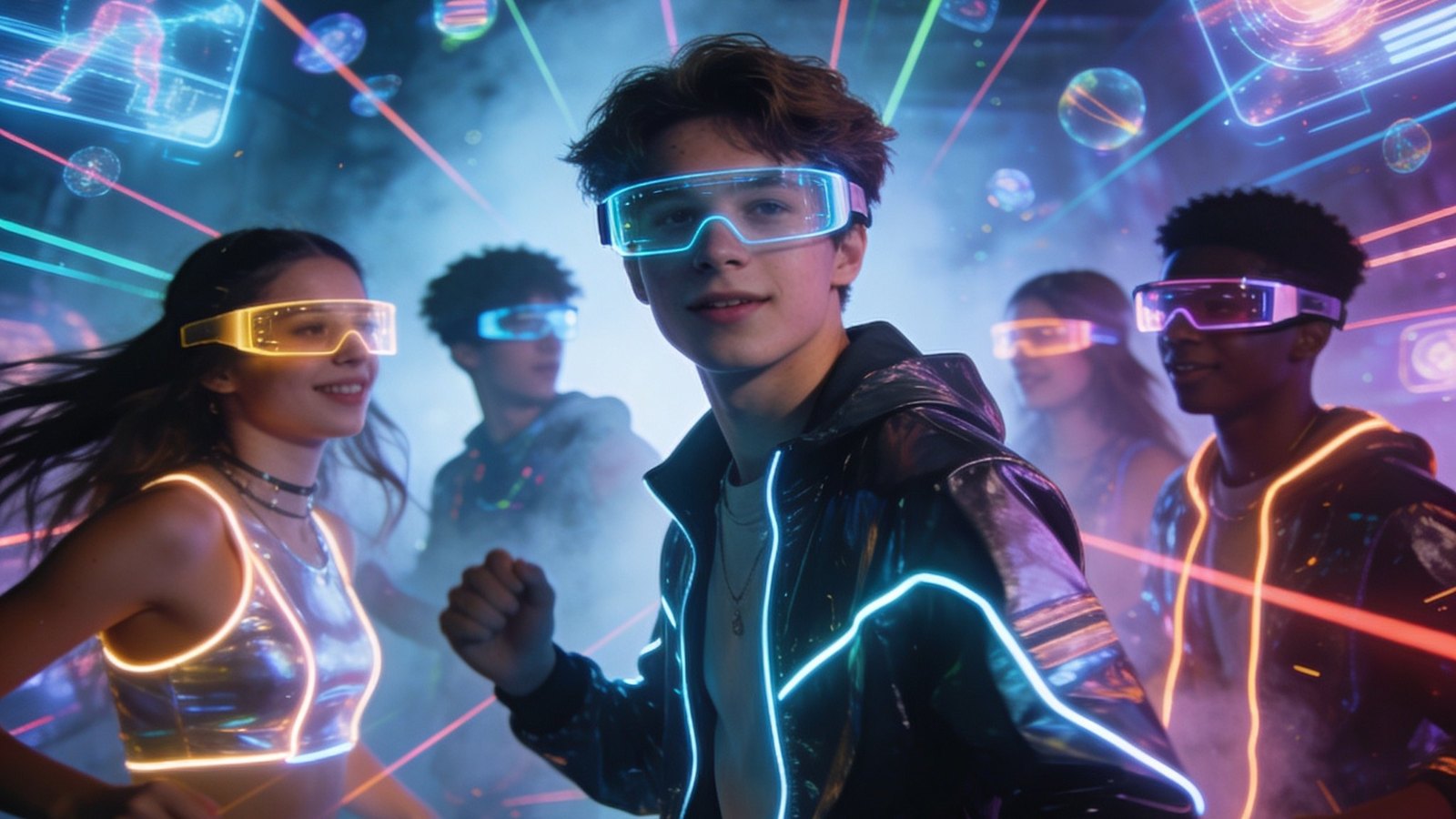
VI · Worlds & abstract
A neon-cyberpunk country town and a geometric color explosion that melts — imagination over realism.
The model
Sharp, saturated, stock-photo slick — and the most literal on the products.
Crisp, punchy, high-saturation. Closer to polished commercial stock than Grok’s grit or Nano’s haze — clean and vivid, occasionally a touch over-produced.
Best product continuity of the bunch. The duck shot actually studs the Crocs, uses the faceted crystal perfume bottle, and lays the multi-blade razor out with its cartridge stack — the closest match to the standalone product photos.
Like the base Nano, it can’t letter — the toolbox comes back blank and the pinup page is gibberish. Don’t reach for it when a sign has to read.
Sharp, saturated takes on both ages, with clearly different young-vs-settled scenes; it reads the life stages well, though the in-image text stays gibberish.
40/40, zero refusals, $1.60 — as cheap as Nano and noticeably sharper. A strong budget photoreal option that simply can’t spell.